

table
→
table →
Overview
Hosting a dinner party, made easier.
A website that helps users host the best dinner parties by organizing guests, recipes, menus, and timelines.
Discipline
UX Research, UI/UX Design
Timeline
September 2023 - November 2023
Tools
UX Research Methodologies, Ideation, Prototyping, Figma, User Testing
Role
UX Designer
The Problem
I noticed a big trend around those in my age group and a little above: we love having dinner together, even if we’re crowded around a cramped table or standing against a counter. One of the bigger hallmarks of growing older must be hosting a gathering of friends in your first apartment or residence, with tons of food and laughter around a table. Thus, I endeavored to capture what makes the dinner party so enjoyable and use that experience to guide a supporting app for those interested in hosting such an event.
How might we make a digital dinner party planning process simple and easy to complete?
Project Considerations
Because I decided to focus on the dinner party as a source of inspiration, I realized that research on social media would be a major factor in developing a useful product. The dinner party is having its moment, while it is not necessarily the glamorous and decadent celebrations of the past with a full table setting, it is still a staple of growing up. I started thinking through many aspects of the dinner party based on my own experiences and perception of the social gathering.
Use social media as a tool for researching common users and strategies for the hosting and implementation of dinner parties
Create a well-rounded research plan to accompany usability studies
Prioritize information architecture as the backbone of the product planning process
Initial User Research
Using my initial project considerations as a general guideline, I started to dive deep into social media to understand more about what my current generation sees as quintessential to the dinner party planning process.
To better organize my research, I took notes on popular posts, perused comment sections, and condensed my findings into themes that I could then glean common pain points and needs from.
Common Pain Points
People are prone to rearranging the guest list many times, depending on how they believe certain guests will harmonize with other guests, which adds to the stress of the process.
Depending on the type of dinner party (potluck vs. completely self-hosted) hosts often have trouble with organizing which guests, if any, are bringing what.
Dinner planning can often be spread across social media sites and formats; for example, some use Pinterest for a general mood board and TikTok saved videos for recipes, but put the bulk of the tedious details of the event on a digital, shareable document like Google Docs. This means that users must access multiple platforms to organize their events.
User Personas

Rei (25) is an up-and-coming young professional who just recently started living on their own. They enjoy cooking for their friends and prefer relaxed social gatherings with a diverse group for interesting conversation. Ren is looking for a tool that helps them connect with their guests more seamlessly than starting endless group chats.

Jenny (37) is a stay-at-home mother who likes to host formal gatherings every month. Jenny uses these gatherings to keep up appearances, debut new recipes, and ultimately gather her family and friends as often as she can while still being reasonable about time commitments. She’s a little disorganized when it comes to the party planning frenzy, so she’s looking for a product that helps organize and lay out the multitude of steps it takes for her to organize a successful event.
Information Architecture
My priority for this project was developing organizational hierarchy in my projects. To achieve this, I settled on using information architecture diagrams to better plan for which paths and tasks should be made for Table.
Check out my simple and complex information architecture diagrams down below ↓


Initial Synthesis
Users need a clear organizational structure to store their best ideas, which should be reflected in the product’s organization.
Guests are tricky variables to manage and therefore need to be highly editable and responsive to changes made by the hosts.
Dinner party planning is a fun but tiring process, and having a tool that integrates smoothly into the flow is invaluable to potential users.
Initial Solutions
Use the information architecture diagrams as a starting point for how a clean user flow can be achieved.
Ensure that each feature of the website is highly editable for users as dinner party planning is a dynamic process.
Prioritize options that allow users to share their work outside of the app.
Ideation
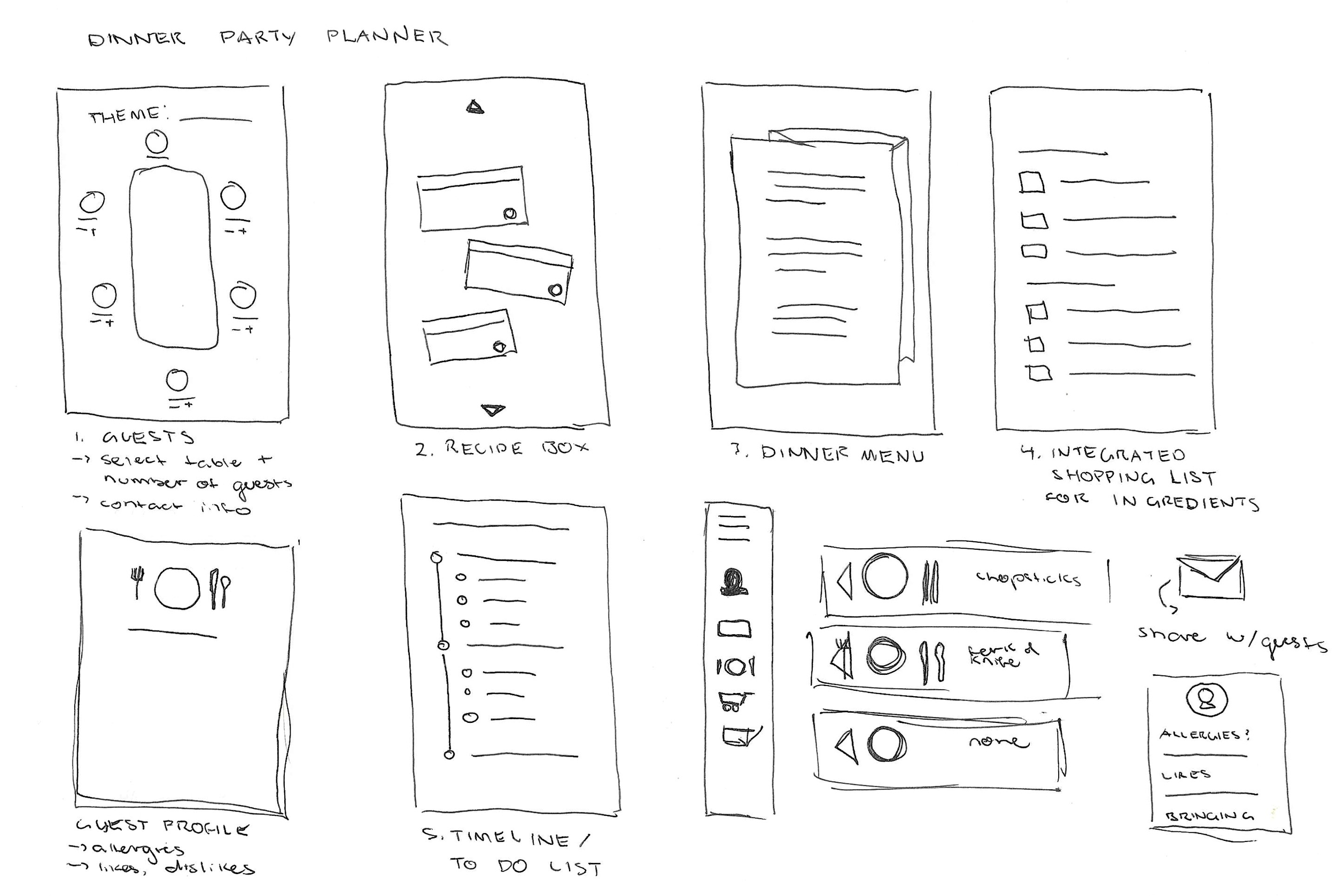
I must confess, this project idea was borne from a series of wireframe sketches before I really committed to the project. These starting sketches were a great way for me to develop the general tone and styling that I wanted to convey, working together with the information architecture diagrams as the basis for Table.
Process
Social media observations + research
Information architecture
Paper wireframes
Low-fidelity wireframe
Mid-fidelity wireframe
Initial prototype
Secondary research
Final prototype

Design: Mid-Fidelity
Check out my mid-fidelity prototype →
You can see the digital wireframes below ↓
After blocking shapes and formatting out from the initial sketches, I began to prototype the mid-fidelity design based on the information architecture diagrams. As you can see, the design changed from the initial sketches to the mid-fidelity prototype; these changes are a result of prioritizing conventional website formatting to fit the content that I thought would be most helpful to users – I wasn’t entirely convinced that this was the direction I wanted to move the website in, but I decided to stick with what I had at the moment.


User Testing
I had concerns about the navigation and feature functionality of my website prototype, so I thought it would be best to run some moderated usability tests and observe how users navigate the website in real time. The testers were given a list of tasks to complete and a system usability scale once they finished, both activities I observed and took notes on.
The UX research study below details my methodology and what I was hoping to achieve by conducting these studies.
Check out my research study below ↓
Tasks
Starting from the login page, what steps would you take to begin planning a dinner party using this website?
If I said, let’s view the guest book page and add a guest card, what do you think you would use this feature for?
How would you describe the process of browsing the recipe book and viewing individual recipe cards?
Let’s say you’re ready to look at the party timeline. What strikes you about this feature?
Try navigating through all the pages of the website. Which path is the most obvious to you?


Final Iteration
Bring it back to what made this idea spark in the first place – creativity and dynamism of social media. Make this reflect in the design and return to what made the first iteration of the work so enjoyable to look at and move around.
Synthesis
Users need more visual cues for interactions to feel like they are progressing towards a final goal; the current look is simple but doesn’t speak to users as they move through the planning process.
There are a lot of possibilities to expand or remove features. This means that this product can be continuously improved, but it should have a secure base first.
Design: Final Iteration
Check out my high-fidelity prototype →
You can see the digital wireframes below ↓
At the end of the user testing stage, I realized that I had received more feedback than praise. My designs were fun but didn’t speak to the functionality of the website that should be clear to a first-time user. While main navigation was clear thanks to the sidebar menu, each feature archive seemed dull to maneuver and didn’t integrate well into the whole visual identity of the product. I was particularly interested in establishing strong branding and iconography that carried throughout the user journey – something that provided a cohesive and direct voice to guide the user. I also dedicated this prototype to narrowing down features and removing unnecessary elements that would be confusing to the user.
The high-fidelity prototype let me tweak the issues I saw in the mid-fidelity prototype, which you can see in the digital wireframes.


Challenges
I found that the biggest challenge during this process was on the design development: I didn’t know when to quit. This was a project that I found myself tinkering with between iterations and coming up with different solutions for each screen, which led to a lot of indecision and worry that caused confusion for user testing. (Even now, I feel the urge to tamper with the designs.) User feedback during the testing phase provided the direction that I wanted to see Table grow in, but I felt like there were still conflicts between the goals of Table and the website itself. While I still don’t feel completely assured, I know that taking a step back to evaluate users before launching another iteration is necessary for the process.
Takeaways
Table allowed me to fall in love with the research process all over again. Using social media as a research resource is new to me and my work, but it fit in perfectly with Table’s goals and audience. I should continue to prioritize knowledge-seeking from unconventional sources to become a more knowledgeable designer.
Further iterations of this project should include outside file storage and use to supplement Table’s purpose of pairing creativity within the planning process. For example, a feature that testers expressed interest in would be a sort of in-website mood board, or an invitation archive where users can upload the materials they produced for the party and store it in one place.